


EAST
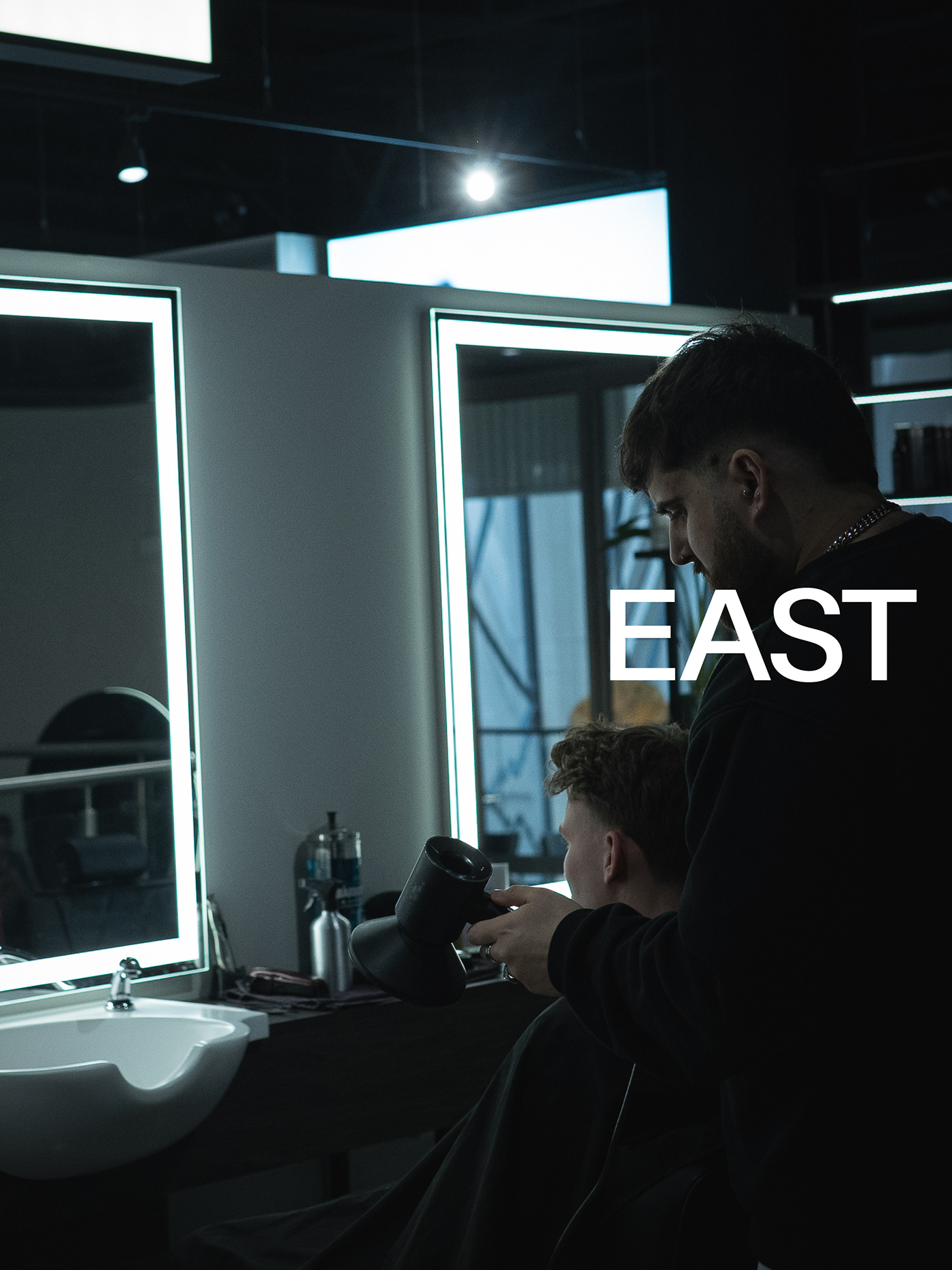
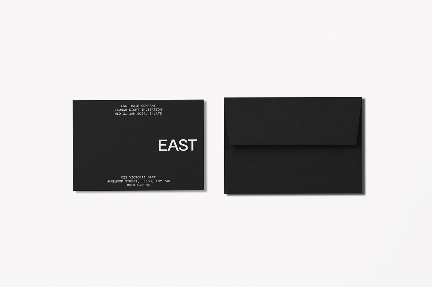
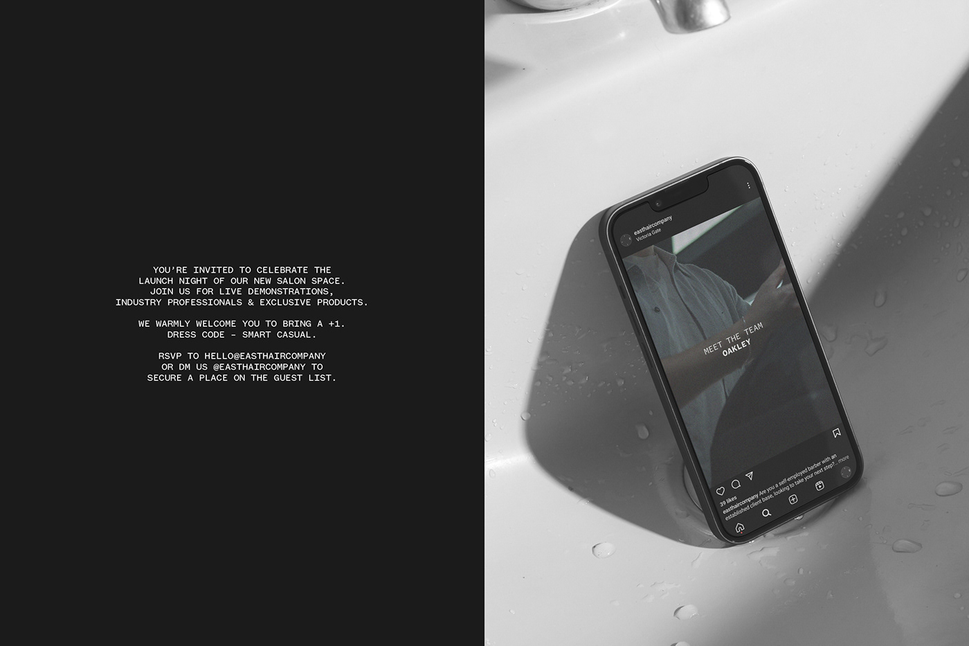
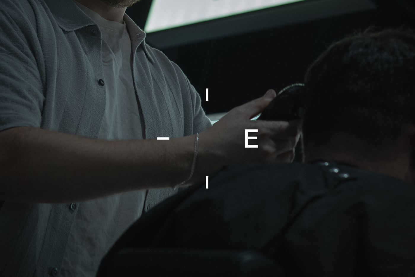
East Hair Company is a slick new salon providing high quality men's hair and grooming services, from precision cuts to premium beard care, all headed up by a team of ambitious barbers. They required a brand identity for their new space that would establish a relevant and coherent visual language, communicating both the company name and its ethos. To achieve this, an uppercase, sans serif wordmark forms the primary logo which, wherever possible, sits to the centre right in its application in order to acknowledge the position of 'east' when typically holding a compass. This theme is then realised in a more literal sense by way of a secondary logo that denotes the four main compass points and highlights the position of 'east' through a solitary initial. The wider identity consists of restrained and sober typography paired with an uncomplicated off-black and white palette. A monospaced typeface features heavily and all text-based content is presented in a manner that subtly references utilitarian design aesthetics, delivering a visual style that mirrors the salon's technical approach.
@jfdesignoffice_


